
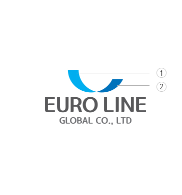
EURO Symbol
The CI ultimately shows dynamic power with energy and hope, and our desire to be an innovative and leading enterprise.
우리의 CI 는 궁극적으로 희망과 에너지, 역동적인 힘을 보여주며
유로라인글로벌이 혁신적이고 업계를 선도하는 기업이 되고자 하는 열망을 보여줍니다.
유로라인글로벌의 CI 는 역동적이고 미래지향적인 이미지를 표현하고 있습니다.
EURO Line Global’s CI was created to project a dynamic and forward-looking image in line with our desired perception by the public.
Process Color는 신문광고, 잡지광고, 실사 출력물 등의 옵셋 인쇄 시 적용되며, RGB Color는 TV 광고, 웹사이트, 방송 데이터 등에 적용됩니다.
Process Colors apply for offset printing such as newspaper advertisement, magazine advertisements, and Printed out an actual data,
And RGB Color applies to TV commercials, websites, and broadcast data.